
SEED: Establishing the communication foundations for a complex interface

The problem
How do you design an understandable, adaptable interface for an ever-evolving massive multiplayer society simulation, while supporting players with very different interests and levels of engagement?
My role
- one of two senior designers responsible for planning and designing the interface for SEED. My focus was on user experience, while my colleague owned the design system.
Context
- SEED as a complex society simulation: SEED's ambition is to be much more than a game - it's a giant sandbox in which thousands of people can build and run societies. It combines life simulation, a multiplayer economy, city building and social and political systems. Players could participate in all of them to varying degrees.
- An (ever-)evolving product: At the time I joined the project, the game still had years of development ahead of it so the interface needed to accommodate change while we made decisions with incomplete requirements. On top of that, the game by its very nature is meant to evolve and grow as players inhabit its world.
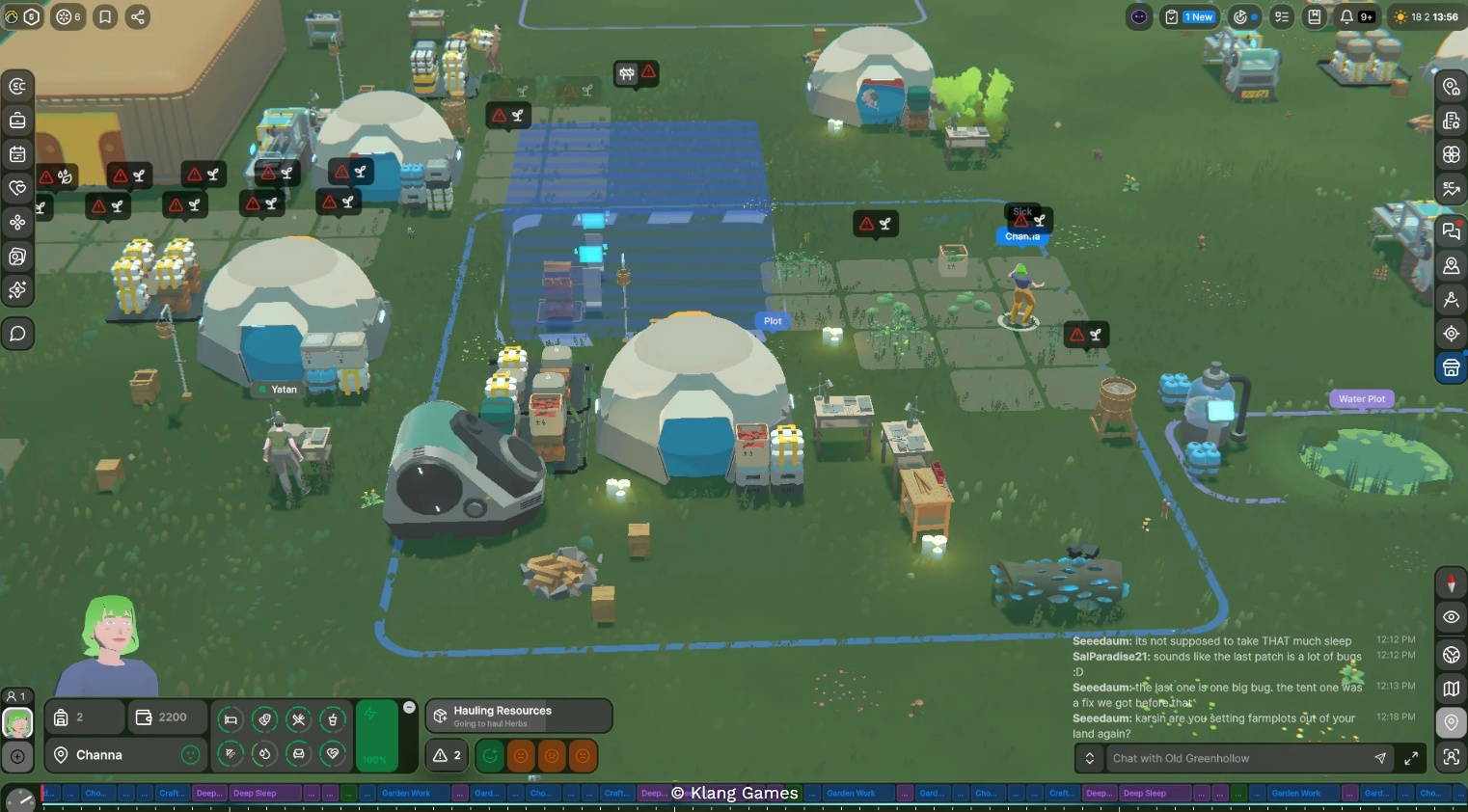
- Limited screen space: As in many games, the 3D game world occupies most of the screen. In case of a project as big as SEED, the pressure put on the game HUD to carry all the information players need is enormous.
- A shared UI direction: My colleague and I built a design strategy for the project's UI structured around a design system, a structured design process for the player experience and a goal to build a flexible interface that minimizes cognitive load.
My approach
Identifying the missing foundation
Despite having established a shared design direction, we still struggled to start building the interface. It seemed that no matter where we wanted to begin, there were too many unknowns and dependencies to establish a reliable interface structure. As I analyzed the interface, and particularly the HUD structure, I realized that we are missing an overview of all the information the player is going to receive.
In a Massive Online Multiplayer game players not only interact with systems of the game (of which there were many in SEED), but they also communicate with each other, make purchases in the game store and can be contacted by the game studio for the purpose of marketing or account management. We were also planning to release a mobile app as an additional entry point to the game.
All of these components of the experience generated information directed at players. Information that was coming from various sources, with different urgency and level of importance. And so far we lacked a shared overview of it.
As I tried to address this issue, I remembered the marketing communication matrix from my work on a loan-comparison website. I adapted the concept for SEED, designing a table to capture information sources, channels, priorities and purposes. I prepared the rationale, an approach to gathering the information and an effort estimate, then pitched the initiative to my PM and head of design.
Building the overview with the teams
Once the initiative was approved, I identified people in each team who had best overview of the systems their were building. Working with them, I first refined the table structure and then collected the information needed to map the communication requirements of each component of the game. Contributors included individuals from production, marketing, engineering and legal teams.
The initiative was announced at a company meeting, and I shared the table across teams for review, comments and additions.
Keeping the design work aligned
I set up a weekly check-in with my PM and design lead to update them on the progress and my design colleague was kept up to date daily as we co-ordinate the UX feature work, the design system work and the progress on the communication matrix. The shared access to the table also gave teams a view of their own communication requirements within the wider context of the whole product.
The communication matrix
Solution overview
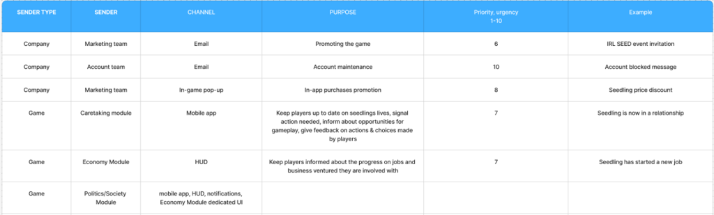
The Excel matrix collected and grouped the information reaching a player who was logged in but outside any particular task flow. This allowed us to understand the flow of information that needed to reach the player even while they weren't actively engaging with any of the game systems. This gave us a tangible starting point for building the interface.
Designing the communication matrix I chose to include the following fields:
| FIELD NAME | FIELD DESCRIPTION |
|---|---|
| Sender Type | Game, company or players |
| Sender | The particular system or team originating the information |
| Channel | Where the information would reach the player |
| Purpose | What the communication needed to achieve |
| Priority/Urgency | Its relative importance, assessed with the relevant team |
| Example | An example of the information being conveyed |
I chose a practical level of detail. Messages with the same communication requirements could share an entry; distinct messages needed separate entries. For example, different kinds of danger to a Seedling could be grouped if they required the same treatment. We could revise those assumptions as features developed.
Priorities used shared reference points, including account suspension and potential fail states such as Seedling death. Other priorities were estimated with teams rather than treated as a formal scoring model.
What the matrix made possible
- Persistent interface requirements: We could identify components, such as player chat, that needed space regardless of the active gameplay.
- Communication across channels: We could decide what belonged in the game, mobile app, website or email, reducing what the HUD needed to carry.
- Clearer component responsibilities: My colleague could design components with a better understanding of what information they would contain, what functions they needed to perform and how they fitted into the interface.
Example: Simpler account notifications
A good example of how this initiative allowed us to design leaner and more intuitive interface is the notification system. By understanding the channels we could use to communicate with players, we knew we could move most of the account related communication to email, website and the mobile app. This meant that the game interface could just use two types of simple notifications: one for important in-game events and one for communicating system-related events.
The simplicity of those components followed directly from the control over information flow afforded by the communication matrix. We knew where the associated information and flows would live, which clarified what the in-game notifications needed to do.
Summary
As I considered how to structure the interface, I identified a gap: we lacked a shared overview of the information it would need to accommodate. Individual teams understood their own systems, but we needed to see the communication requirements across the product before defining the responsibilities of interface components.
The communication matrix I developed opened up a path to designing a responsive, intuitive interface that respected player's attention. It allowed us to allocate communication across channels, define persistent interface requirements and it gave components clearer function.